Photoshop - B&W to Color Photo
Photoshop
~B&W Photo to Color Photo~
~B&W Photo to Color Photo~
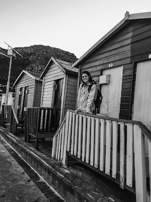
For this project, I chose to use a picture of me standing on the Beach Huts at Muizenberg Beach, Cape Town, South Africa. This photo is perfect because the original one displays a vibrancy of colors as well. I would describe them as lego colors - yellow, red, green and blue.
Fun fact: Muizenburg Beach is known for its surfing community. Also, home of many great white sharks. When I was there back in the summer of 2017, I remember walking around and there being giant wooden signs asking the public to beware of the great whites.
Fun fact: Muizenburg Beach is known for its surfing community. Also, home of many great white sharks. When I was there back in the summer of 2017, I remember walking around and there being giant wooden signs asking the public to beware of the great whites.
This is my first Black and White to Color Portrait of the three that are shown below. This is the first time I have transformed a black and white photo into a vibrant, revived photo. For this particular version, I chose to use the Analogous palette. I really enjoyed this project because of the challenge that was presented by being forced to only use colors from the palette. Making the photos look normal was a real challenge. However, this Analogous image seems to come to life. When creating this photo I tried to depict what the photo would look like if the color were absent. Editing this photo reminded me of the past when cameras could only take photos in black and white. This photo aims to depict a blast from the past.
This was the next portrait that I did for this project where I chose to use the Complementary palette. This one was much easier to create because I was more familiar with the techniques. After creating this photo I believe it could be mistaken for a cartoon. I think that is the beauty of the photo
This is the last of the three colored portraits. This was also the hardest one to complete. Monochromatic coloring is within a similar color scheme. Which is why I found it challenging. If I chose a different set of colors through the Adobe color wheel, with this setting, It may have been easier. Because I would have made the colors different in contrasts, instead of on the darker side. Therefore, next time I would love to approach the colors different with a scheme that spices it up.
Thank you for reading! I am looking forward to applying this new skill to future tasks.


Comments
Post a Comment